Add/ Edit/ Delete/ Share Dashboards & Reports
Steps:
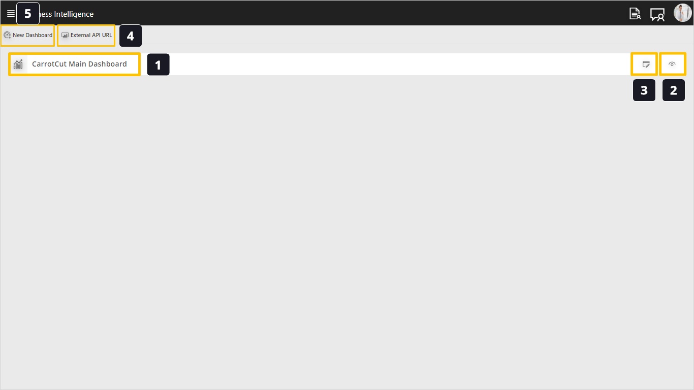
- To start, open the Business Intelligence module, in the landing page you will find a default pre-defined dashboard called “CarrotCut Main Dashboard”.
- Using the Eye icon we can open the dashboard for viewing only.
- Using the Edit action we can open the dashboard for editing if you want to make changes.
- Using the External API URL action allows us to extract the dataset and make it accessible for external dashboard builder tools which want to analyze data from CarrotCut. An example for this is a Microsoft Power BI developer who wants to create charts from CarrotCut data.
- Click to build a new dashboard.
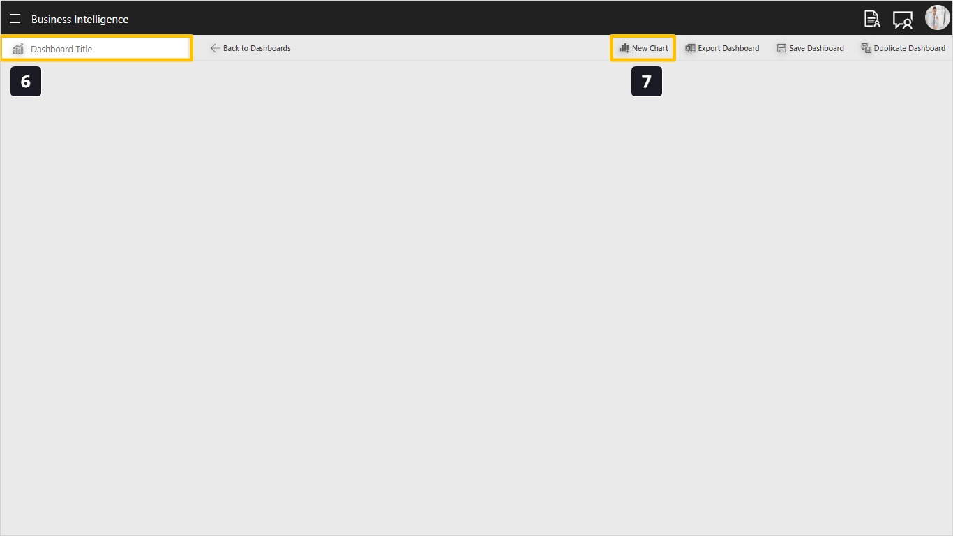
- Once you see the newly created dashboard you can immediately give it a name.
- Click the New Chart to add your first chart in the dashboard.
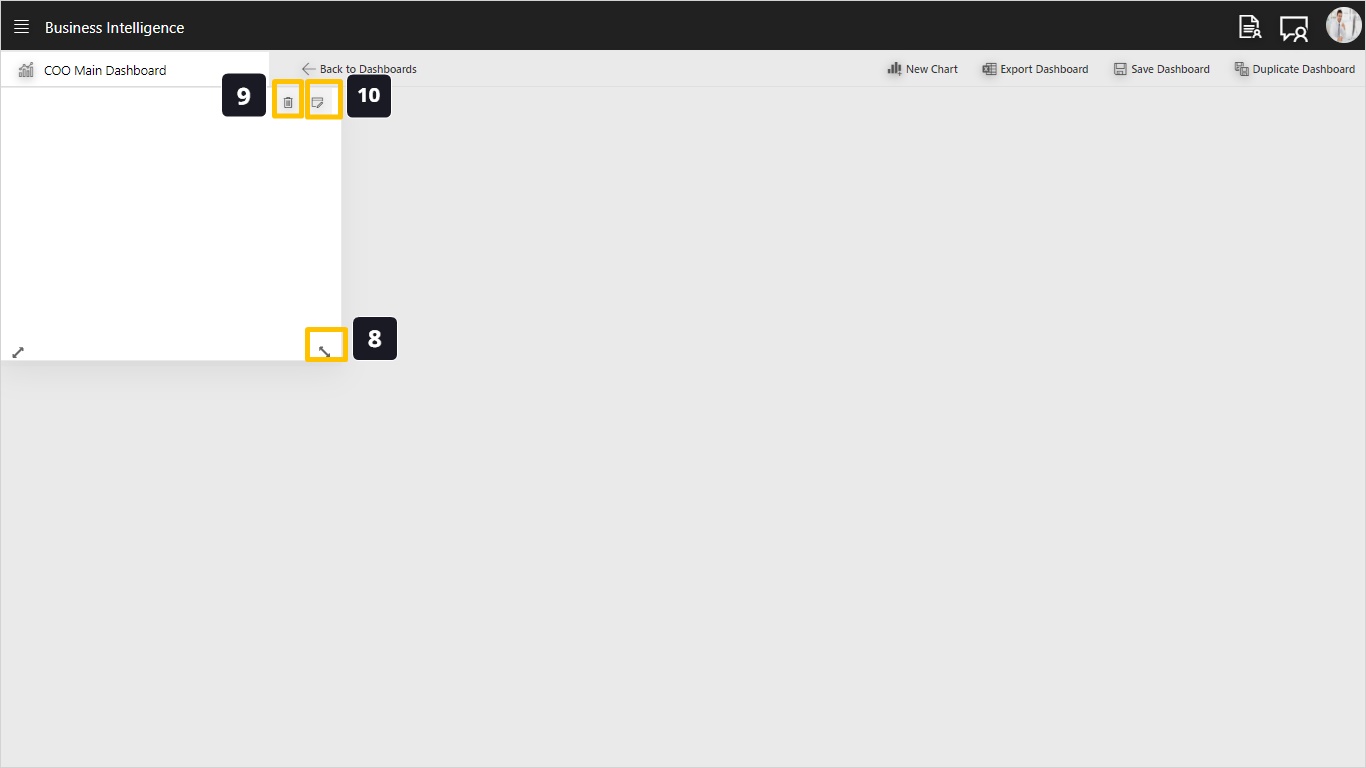
- Using this handle we can drag to resize the chart. We can also move the chart around in the dashboard by dragging from the middle of the chart.
- Use the Delete action to remove this chart from the dashboard.
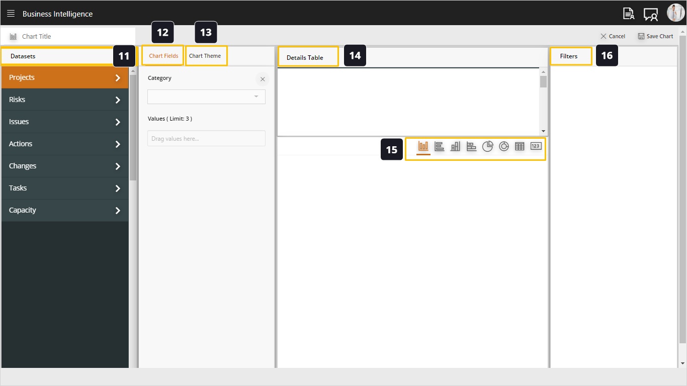
- To build or modify this chart use this action.
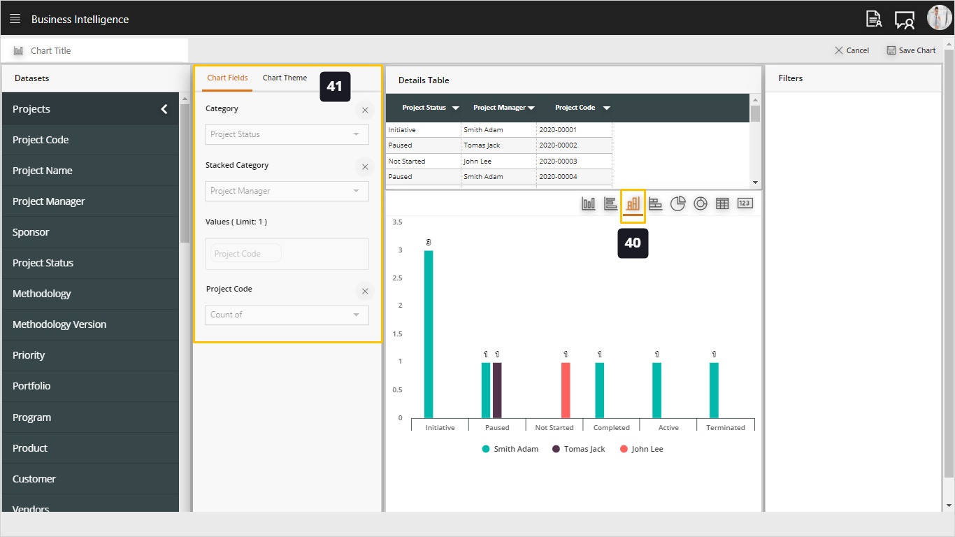
- Datasets is basically a collection of all data available in CarrotCut, categorized as Projects, Risks, Issues, Actions, Changes, Tasks & Capacity. Each dataset contains relevant data as the name indicates, for example, Projects Dataset contains the project ID, Project Name, Start and Finish Date…etc.
- The chart fields are the components (data) that make up the chart, usually a chart is built using 2 dimensions (categories and values). For example, we can show the count of projects by status. The count of projects is values and the status is the category.
- Chart theme allows us to change the colors and description of the chart columns.
- In the details table we can build the details that will be used when we click any chart to see the drill down data.
- As we can see we have several types of charts such as column, bar, stacked, pie, and card…
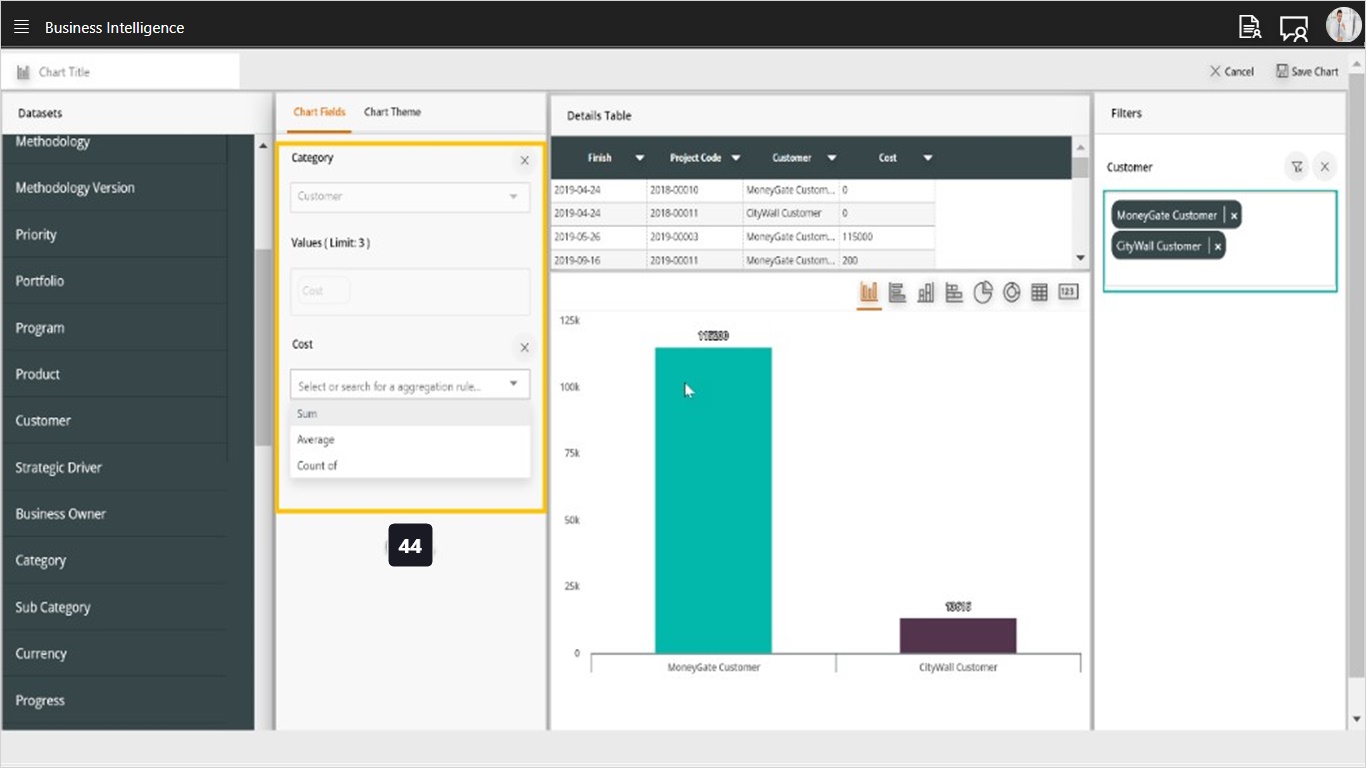
- Use the filter field to reduce the set of data to match certain criteria, for example, show only the completed projects.
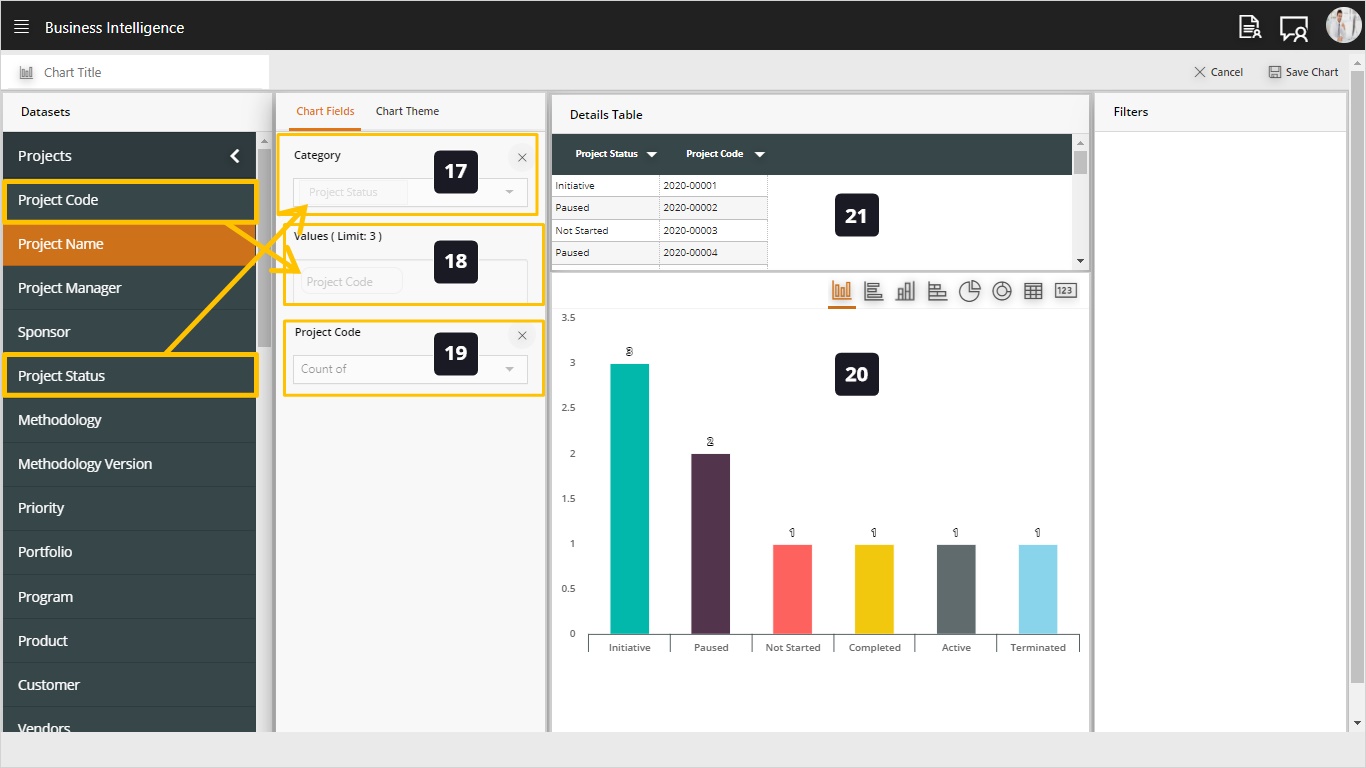
- Drag and drop fields from the dataset to the category, the category is what you want to group data by.
- Also use drag-drop to define your value field, this would be the value of the chart, for example, a count of project ID.
- Here you can define the operation to perform on the value field, for example, for Project ID we can show the count of values while for a budget or cost field we can show either the sum or average of the value.
- As you can see the data chart will be generated, by default it will use the column chart type as specified in the category and value fields.
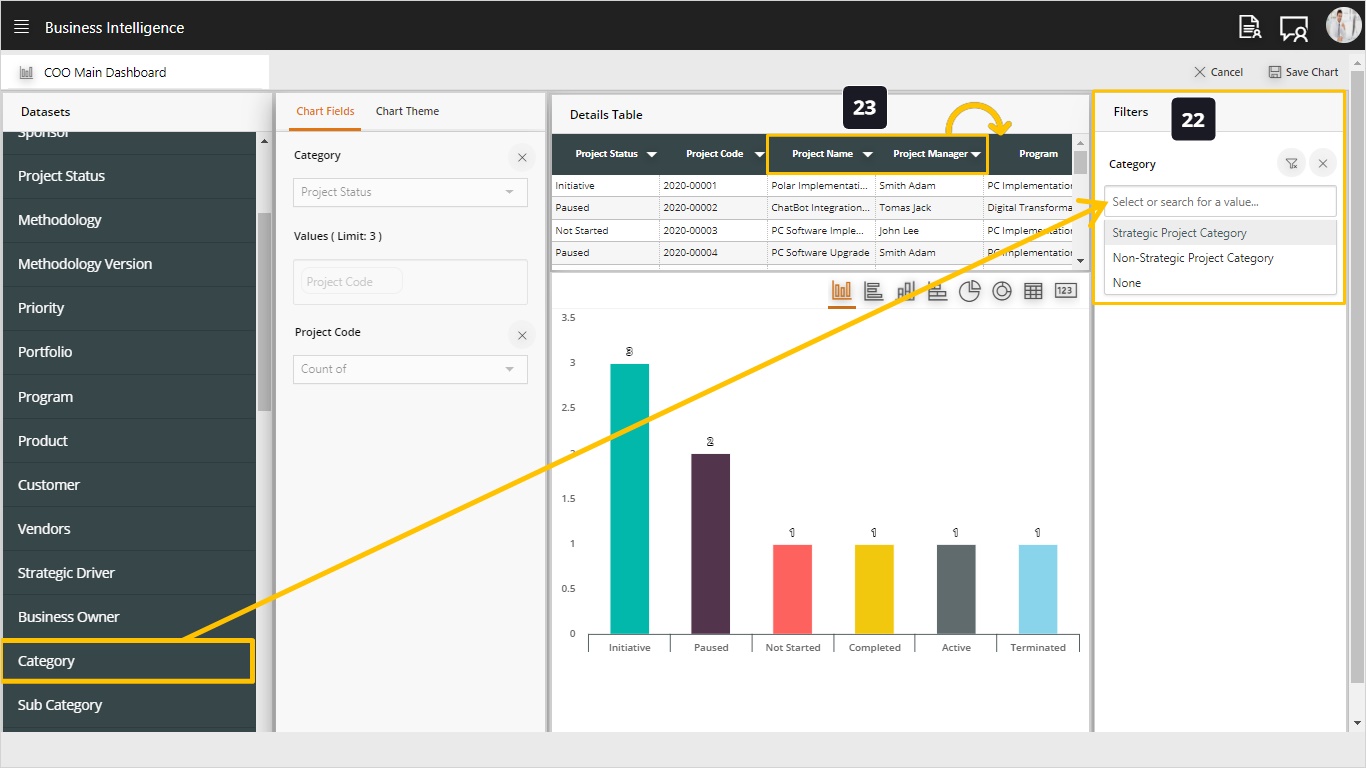
- Here you can define the details table for this chart. This will be used when users drill down on the chart to see more details.
- Using the filter field we can reduce the data in the dataset to match certain criteria. For example, chart only the completed projects, or projects managed by a specific project manager. Use drag drop to create one or more filters.
- In the details table, we can use drag-drop to re-arrange the columns.
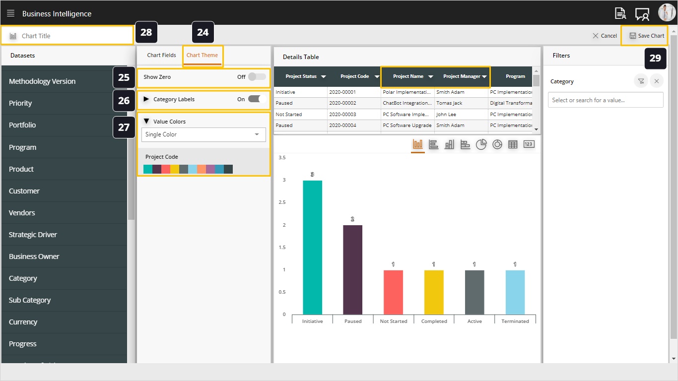
- The Chart Theme allows us to define more configurations of how the chart will be displayed.
- Show Zero option dictates if the chart will show the value of zero in the chart values. Otherwise, it will be hidden.
- When setting Category Labels on, we can define customized colors and labels for each category in the chart.
- Fill customized labels in the desired categories (optional) and click the colors from the displayed palette to set a color for each category.
- Define a name for the chart.
- Save your chart using the Save Action.
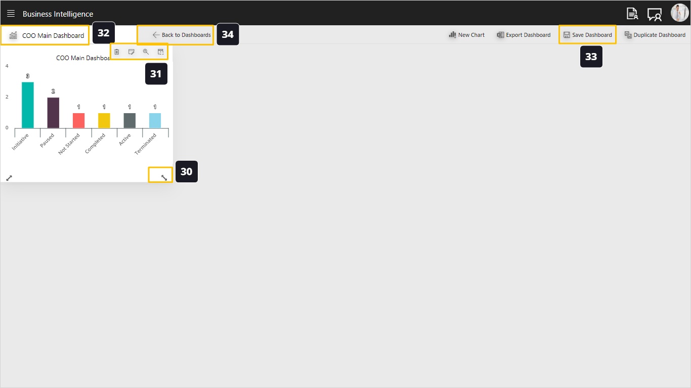
- Use this handle to drag-drop the chart corners to resize and move your chart.
- Use this tool bar to:
- Delete the chart
- Edit the chart
- Zoom the chart to open in in wide mode
- Show the details table
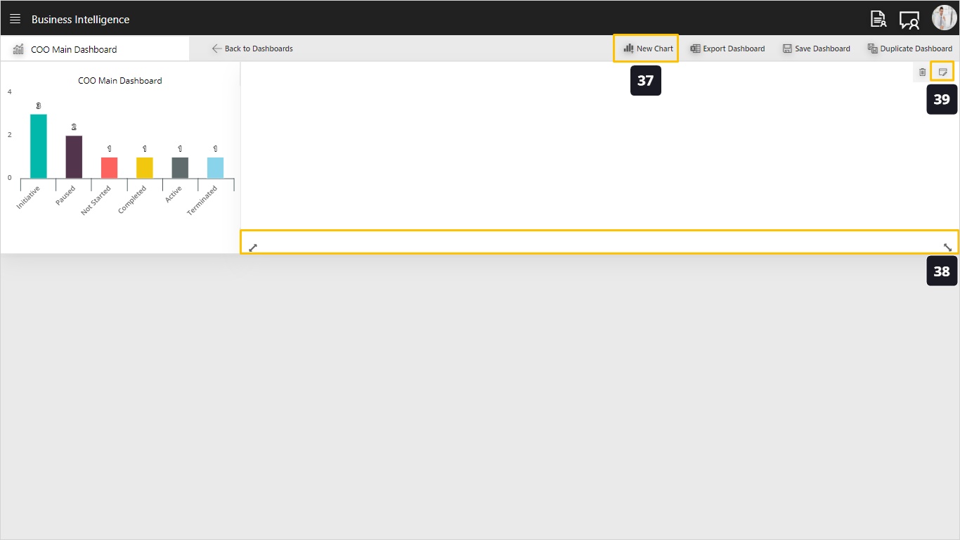
- Name the dashboard.
- Save your dashboard!
- Go to the dashboards landing page.
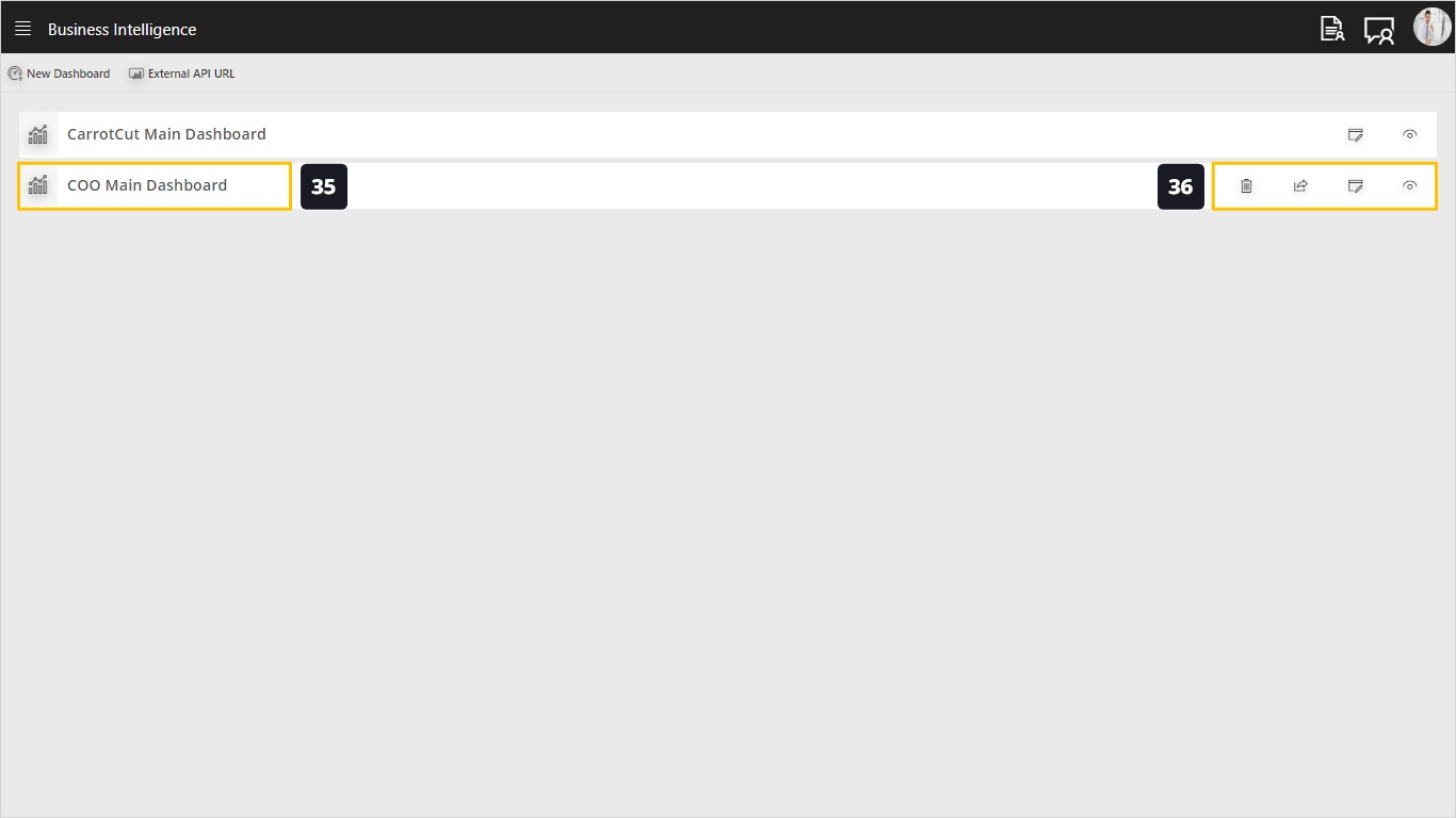
- This is the dashboard that we just created in the above steps.
- Use this toolbar to perform several actions on this dashboard, including;
- Delete the whole dashboard
- Share the dashboard, which we will explain later on. We can share the dashboard to selected or all users, as follows:
- Always share, which shares this dashboard for all existing and newly added users
- Specific Share, which shares the dashboard to specific users only.
- View the dashboard in read only mode.
- Edit the dashboard to define another chart.
- Click to add a new chart.
- The newly added chart can be resized and moved using drag-drop.
- Click the edit action to edit your chart.
Now let’s build a stacked chart.
- Choose the chart type – Staked Bar Chart
- Choose the Projects dataset and drag the Project Status field to the Category and the Project Manager field to the Stacked Category and the Project Code to the Value field. See how the chart looks like which shows an internal categorization inside the status field and that allows you to create richer visualizations of each data. This case is used when you want to show data by two factors, for example, projects by status and project manager.
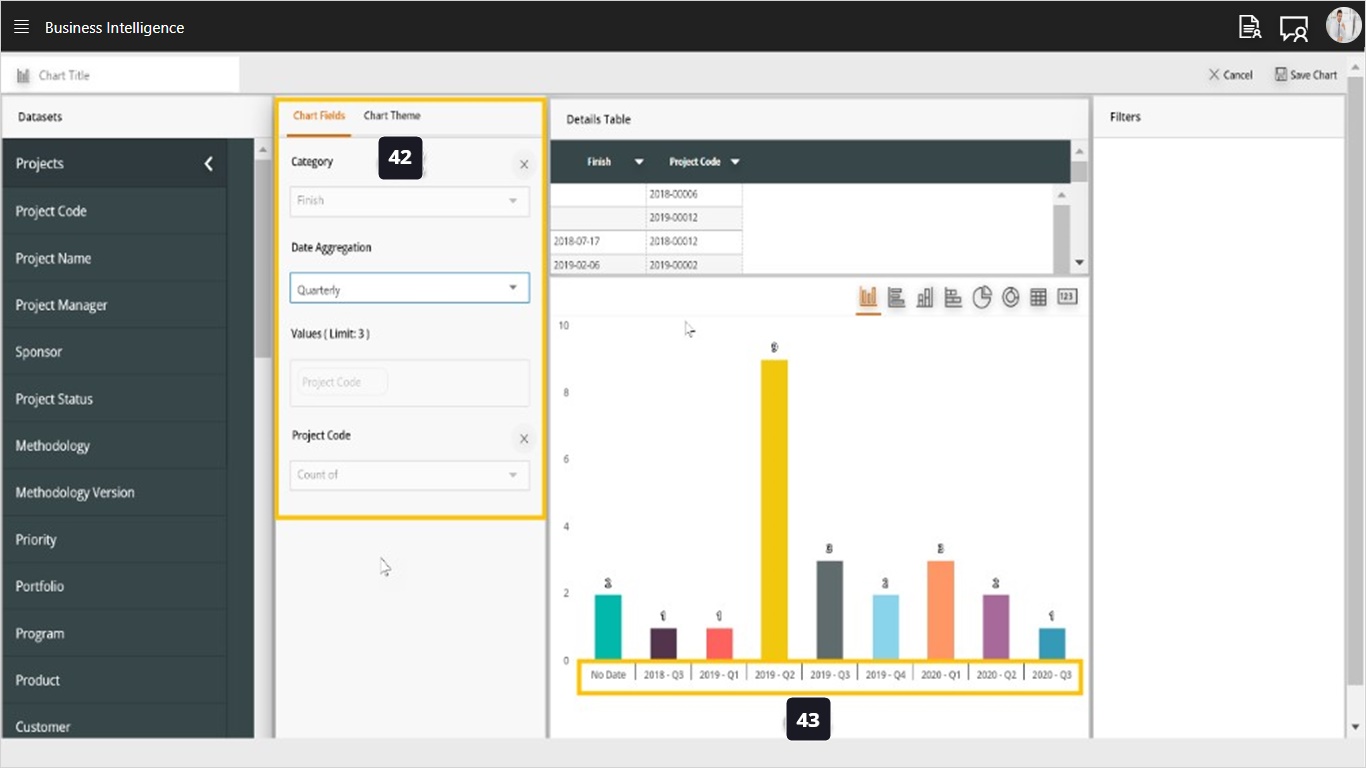
Now let’s build a time-series chart.
- Select a date field for the category (for example the Finish Date of a project). Because this is a date field we can group the values as time series (Monthly, Quarterly, Annual).
- Notice how the chart is grouped by quarter.
Let’s learn how to use Average and Sum for numerical values.
- When using a numerical value (like project cost), we can aggregate the value either using the Sum (total) or Average of the values.
Let’s see how to build tabular reports using the dashboard builder.
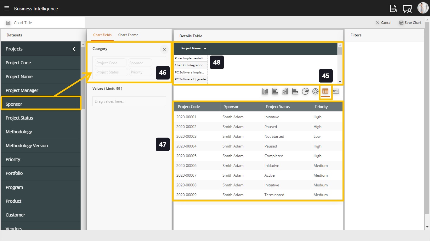
- Select the table chart type from the available types.
- Drag drop the desired fields into the category field.
- Notice how a tabular report is building up!
- There is no need to fill the details table since the tabular report below contains the details.
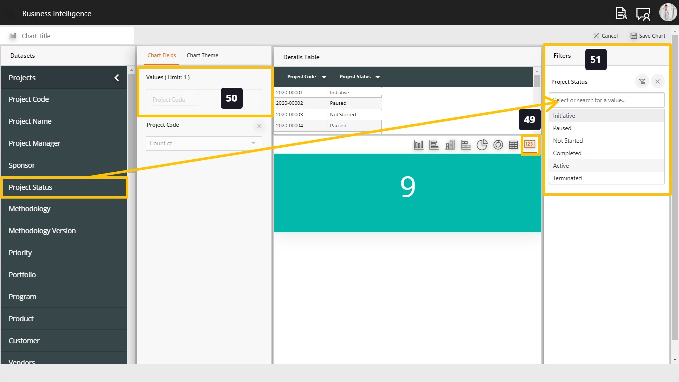
Let’s see how to use the Card type of charts!
- Select the Card type from the available types.
- Drag and drop the desired value from the dataset, for example the project code, this will show the total count of projects in your repository.
- You may optionally use filters to reduce the count, for example, count only the active projects.
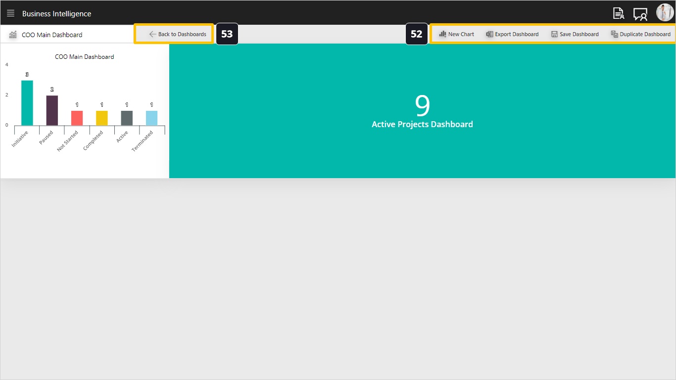
- Notice the Dashboard Toolbar which includes the following actions:
- New Chart
- Export Dashboard to Excel, this is a very useful function where you can export the dashboard to Excel for additional calculations or formatting.
- Save the Dashboard
- Duplicate Dashboard, if you want to build additional variations of this dashboard.
- Back to the Dashboards landing page!